Team India’s Olympic uniforms, designed Tarun Tahiliani, called ‘cheap’ and ‘tacky’ | Trending

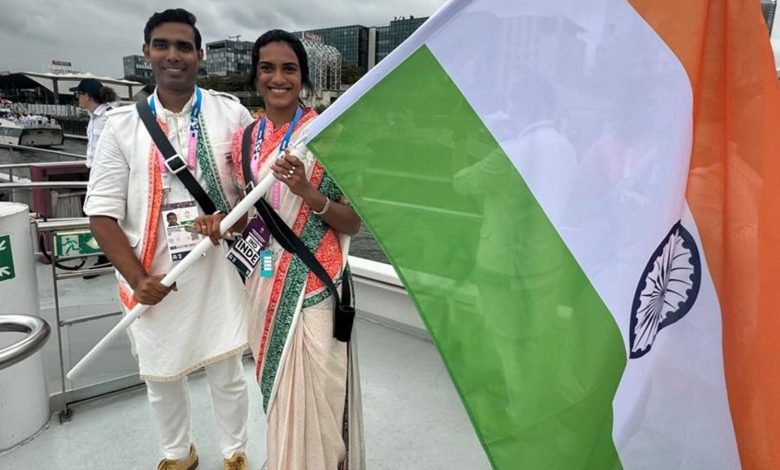
Celebrated fashion designer Tarun Tahiliani’s ikat-inspired uniforms for the India contingent at the 2024 Paris Olympics have failed to impress. Hours after Team India, dressed in the colours of the national flag, floated down River Seine during the opening ceremony of the Olympics, the uniforms were slammed as cheap and tacky on social media. Team India’s Olympic kit did not match the internet’s exacting standards. “Hello Tarun Tahiliani! I have seen better Sarees sold in Mumbai streets for Rs.200 than these ceremonial uniforms you’ve ‘designed’,” wrote X user Dr Nandita Iyer. She called it a combination of digital prints, cheap polyester fabric and the tricolour thrown together without any imagination. Others shared similar sentiments. More than a few people evoked India’s rich legacy in textiles and handloom while wondering why the team was presented in such a “shoddy” way at such an important global platform. Actor Tara Deshpande wrote: “They look absolutely awful. We have the greatest textile tradition in India. Who passed this design? Who budgeted for this?” “Crumpled kurtas, polyester printed sarees. Faded colours. Coming from the land of a hundred plus handloom fabrics, numerous outstanding weaves and vibrant colours. Travesty,” wrote X user Namita. Tarun Tahiliani faces backlashThe uniforms saw male athletes dressed in a white kurta pajama with a jacket featuring the saffron and green of the Indian tricolour. Women athletes wore sarees. However, the fact that Tarun Tahiliani, a renowned designer, was behind the uniforms left many surprised and angry. “This is the best that Tarun Tahiliani could come up with? We are so used to our athletes looking so smart, normally. This feels like he phoned in the design,” X user Ajay Kamath opined. Users also wondered why the designer opted for printed uniforms when genuine ikat weaves could have been incorporated into the design. “At world’s fashion capital, an Indian athlete looked like this – dull and ordinary. Tarun Tahiliani’s mix of plastic-sheet-like saree, printed ikat and unimaginative use of tricolour, shut window to splendrous world of Indian textiles,” said Malayalam writer NS Madhavan. Tahiliani’s defenseIn an exclusive conversation with The Hindu, Tarun Tahiliani had earlier defended the choice of ikat print vs weave. The New Delhi-based designer said he chose ikat as “emblematic of a weaving tradition practised around the country.” However, his Tasva team had to use digital print ikat to meet timelines. The choice of viscose over cotton was also deliberate. Cotton would have crushed badly. We used viscose because it is a wood pulp fibre and lets you breathe. It is cooler than silk,” he said. “We had to consider breathability because the athletes would be on a barge, in the heat, for up to five hours.”


